
Objective
This school project centered around a museum wanting to promote an upcoming exhibit. The required deliverables included a holiday greeting card, a 2-page digital newsletter, and a print-ready booklet.
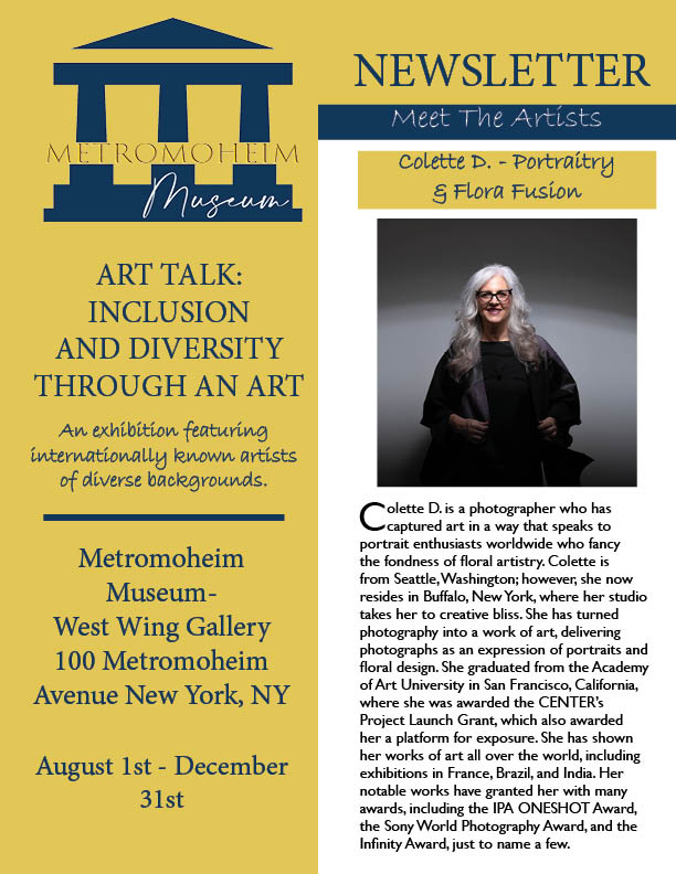
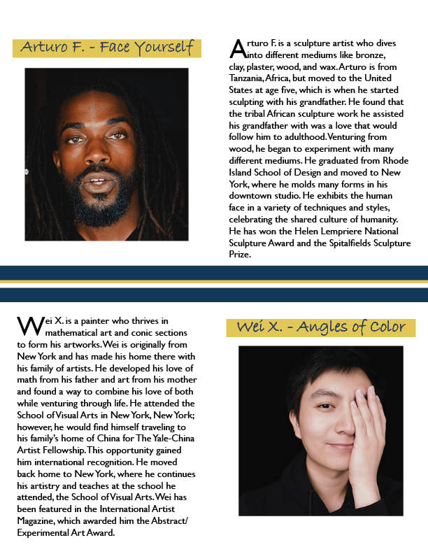
*Logo provided by client. Artist bio images are free to use under the Unsplash license. Artwork images (provided by the school) are from the Smithsonian American Museum Collection (usage conditions apply as is).
Deliverables
Greeting card:
2-page digital newsletter:
Booklet for print:
Process Overview
Tools used: Adobe InDesign.
The Metromoheim Museum project (school project/fictional) includes three deliverables created using InDesign. The logo, brand colors, artist images, and copy were all mandatory and provided. The first deliverable is a 2-sided, folding, holiday greeting card. The second is a 2-page electronic newsletter. The third is a printable, 10-page booklet focusing on one artist and his featured works. Exact measurements, alignment, spacing, use of negative space, and color usage were crucial.
Another key element for this project was audience expectation for a professional and uncomplicated style that keeps the focus on the artists, their works, and the museum. For the greeting card, considerations had to be made on how the card would fold (direction and fold line space) and the order of the panels. The first page reads from the back cover then the front cover. The second page reads from inside left to inside right. On the newsletter, negative space, creating hierarchy with typography choices, and color help to segment a large amount of content and direct the viewer’s eye. For the booklet, considerations on alignment and placement of the copy on the artist’s works pages had to be considered carefully because the images were shaped and sized differently on each page. The typography, alignment, and placement choices were kept the same on each work’s page (instead of being aligned with the images) so the viewer would not have to search for the information on each page. The minimal design keeps the focus on the artwork. The subtle variations in typography help differentiate the subject matter.
.
