
Objective
Fresh Fare Farms is a fictitious food delivery company that focuses on local, sustainably grown produce and wants to cater to a younger Gen Y and Gen Z audience. My given objective for this school project was to create a multi-channel ad campaign that adhered to the brand’s mission, targeted a specific audience, and promoted a special campaign event. The deliverables I created were an animated display ad, a social media seamless carousel ad, and a magazine ad for print.
*Logo and graphics (shapes) provided by client. Images in deliverables and moodboard were found on Pexels.com and are free to use under the Pexels license. The carousel mockup was created using a free mockup generator.
Deliverables
Animated display ad (GIF):

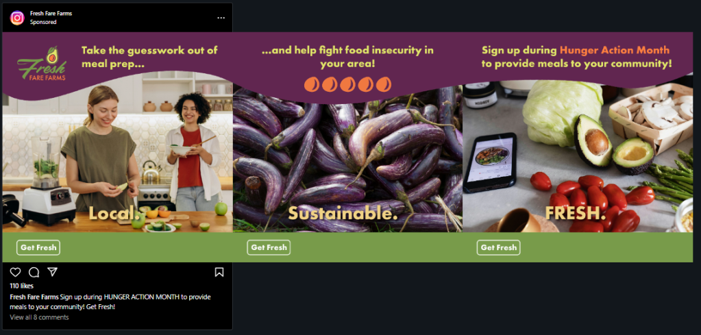
Seamless carousel ad for social media:
Magazine ad for print:
Process Overview
Tools: Adobe Illustrator, Photoshop, and InDesign.
Mood board:

Creating mood boards and mind maps are one of my favorite steps in the design process. They are a great way to organize assets and ideate. I will sometimes create several mood boards, playing with style (minimal/maximal or low-mid-high range) before settling on a final choice.
To enhance brand recognition and consistency across the deliverables, I used the full-color logo above the same secondary color in the top left side of the composition. The call-to-action buttons in the display and social media ads are of the same color and style. Color and typography choices all represent the company’s branding. Color is used as background to create depth and contrast while also segmenting text into digestible portions and highlighting keywords and phrases.
The display ad (leaderboard) has a fade in/out glowing effect applied to the call-to-action button to grab the viewer’s attention. Aligning with the design brief, the carousel ad and magazine ad use imagery (some of which is repeated) that represents the organization’s target audience of college students and young professionals, the products being offered, and a connection to technology (the smart phone). The purple background shape in the carousel helps to create a seamless effect by connecting the three panels. The seed graphics in the middle panel are taken from the logo and help fill in negative space. For the magazine ad, I used color, typographical variations, and shapes to help organize and segment the large amount of copy.
